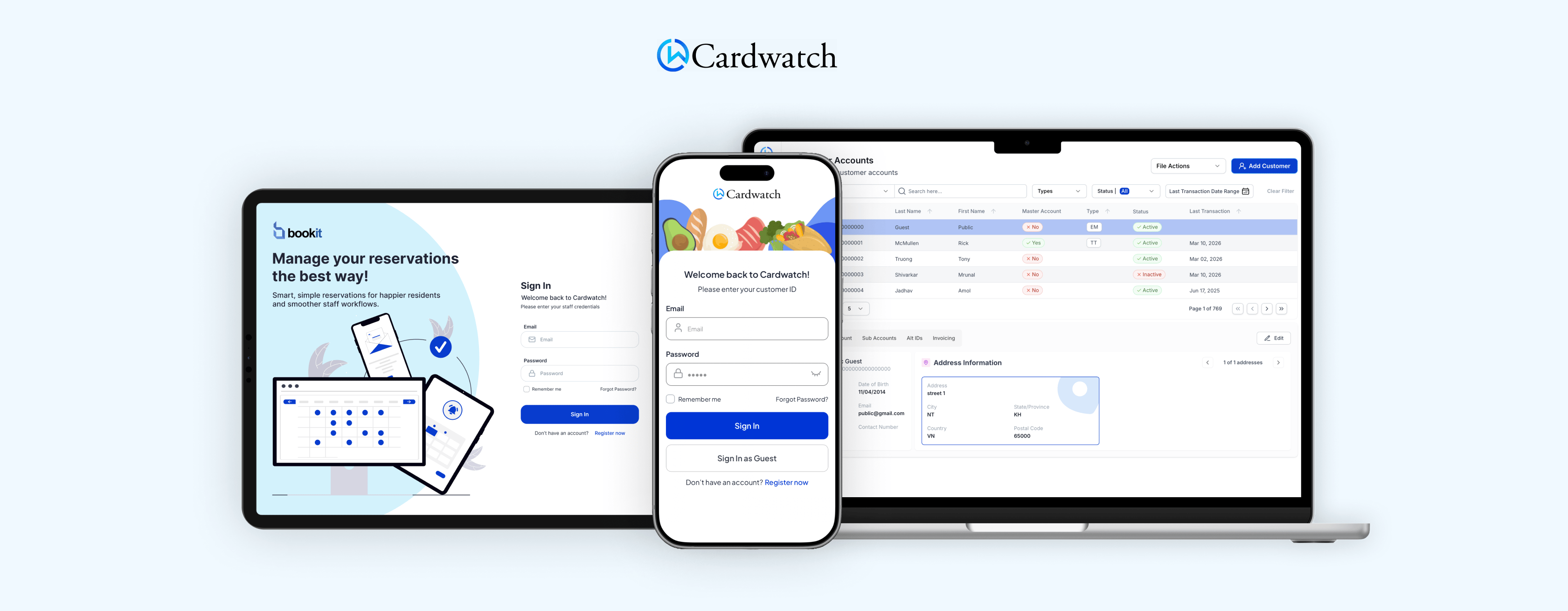
Cardwatch 4.0 Suite Redesign
Modernizing a multi-product SaaS suite for senior living operations, with a focus on usability, accessibility and cross-product consistency.
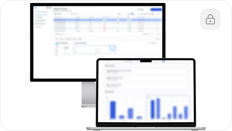
PRIVACY NOTE
Some product details and visuals have been simplified or partially obscured due to confidentiality. I’m happy to walk through more context, process, and outcomes over a call.
YEAR
2024 -
2026
ROLE
Lead Product Designer
UX Researcher
UX/UI Developer
TEAM
1 Project Manager
1 Product Designer
4 Developers
1 QA Tester
PLATFORMS
Web
Tablet
Mobile
Kiosk
SCOPE
5 core product surfaces across the Cardwatch 4.0 suite
THE CHALLENGE
Cardwatch’s product ecosystem had grown across multiple apps and operational workflows, but the experience lacked consistency, accessibility, and modern UX structure.
Staff needed to move quickly across reservations, dining orders, table management, self-service ordering, and back-office operations, yet the interfaces often created unnecessary friction and visual inconsistency.

How might we make operational workflows clearer and easier to complete?
How might we create more consistency across multiple products and platforms?
How might we improve accessibility without compromising speed in fast-paced environments?
STATUS QUO
This is not a 0 → 1 product. Cardwatch already had a live suite of products used in senior living communities, with existing workflows, stakeholder expectations, and technical constraints. My work focused on redesigning and modernizing core interfaces while respecting real operational needs and implementation realities.
PROCESS
- Auditing the existing experience
I started by reviewing the existing Cardwatch 4.0 product suite to understand where the experience was creating friction. Because the platform spanned multiple apps and workflows, I focused on identifying repeated UX issues across the system: inconsistent layouts, unclear hierarchy, dated interaction patterns, and flows that required more effort than they should have for staff working in fast-paced environments.
- Identifying the highest-impact workflows
Rather than treating each app as a separate redesign, I looked for the workflows that mattered most across the suite. I prioritized the areas where clarity, speed, and ease of use were especially important, such as reservations, ordering, table management, self-service interactions, and back-office operations. This helped me focus the redesign on real operational needs instead of isolated screen-level changes.
- Redesigning for clarity, consistency, and accessibility
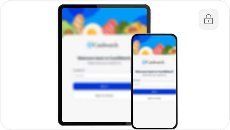
From there, I redesigned the interfaces with three goals in mind: making workflows easier to understand, creating more consistency across products, and improving accessibility throughout the experience. I simplified information hierarchy, clarified task flows, introduced more reusable UI patterns, and designed with real-world use in mind so the products felt more intuitive for both staff and residents.
- Collaborating through implementation
Because this was live product work, the redesign process was closely tied to implementation. I worked alongside product, development, and QA to refine designs based on technical constraints, product priorities, and testing feedback. This helped ensure that the final solutions were not only visually stronger, but also realistic to build, maintain, and ship across the broader Cardwatch ecosystem.
FINAL RESULT
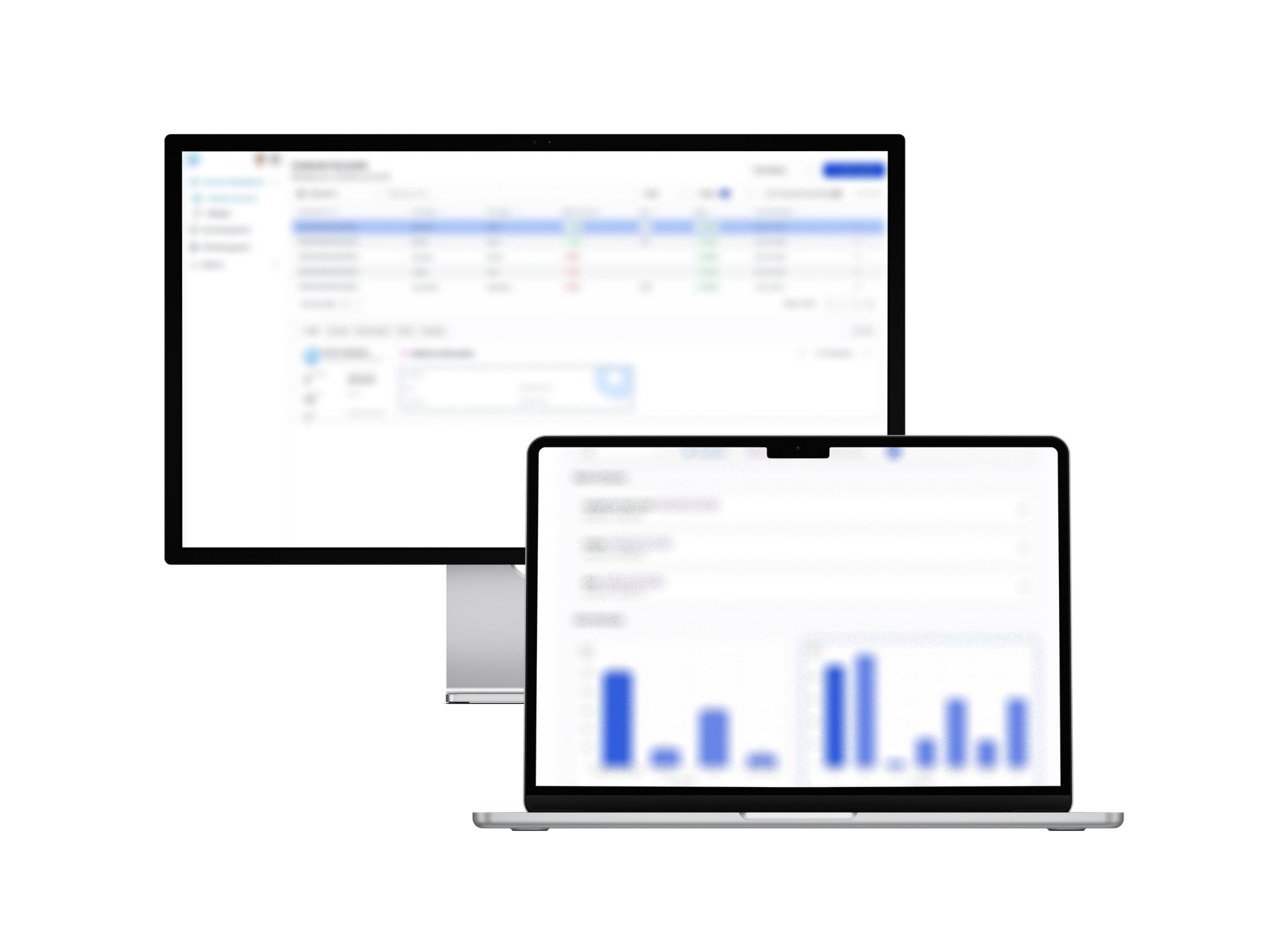
The redesign resulted in a more unified and usable product suite across Cardwatch 4.0, with clearer workflows, stronger consistency, and more accessible interactions across multiple operational surfaces. Instead of treating each product as an isolated interface, I approached the suite as a connected ecosystem and designed the final experience to feel more coherent across reservations, dining, ordering, self-service, and back-office operations.

Clearer workflow management
Across reservation, ordering, and table management flows, I simplified task structure and improved information hierarchy so staff could complete key actions with less friction. The redesigned interfaces made scheduling, order handling, and real-time operational decisions easier to scan and act on, especially in environments where speed and clarity matter.

More consistent product patterns
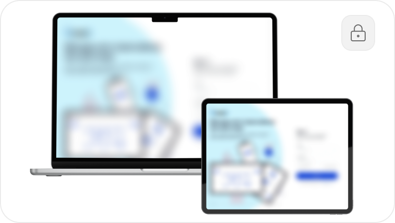
A major part of the redesign was introducing more consistency across the suite. I aligned layouts, interaction patterns, and UI structure across different products so the experience felt more predictable from one interface to the next. This helped create a stronger product system and reduced the sense that each surface had been designed independently.
Accessibility and usability improvements
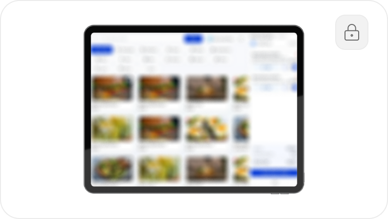
The final designs placed stronger emphasis on readability, hierarchy, and interaction clarity, with the goal of making the products more accessible in real-world use. This was especially important for self-service and resident-facing experiences, where the interface needed to feel straightforward and intuitive for users with different levels of technical confidence.
Stronger operational and back-office tools
For administrative and back-office interfaces, I focused on making dense operational information easier to navigate and use. By improving structure, surfacing key controls more clearly, and reducing visual clutter, the redesigned tools better supported staff responsible for configuration, reporting, and day-to-day operations.
IMPACT
The redesign helped move Cardwatch 4.0 toward a more consistent, modern, and accessible product experience across multiple applications in the suite. By improving workflow clarity, aligning interaction patterns, and designing with implementation in mind, the work supported both day-to-day usability and longer-term product consistency across the platform.
5
Production apps redesigned
across the Cardwatch 4.0 ecosystem
4
Platforms covered
web, tablet, mobile, and kiosk
~30%
Reduction in support escalations
estimated from simplified task flows
2×
Faster task completion
for core reservation & ordering workflows
WCAG 2.1 AA
Accessibility standard met
for core reservation & ordering workflows
LEARNINGS
Redesigning Cardwatch 4.0 reinforced how important systems thinking is in multi-product work. The biggest improvements came not just from refining individual interfaces, but from creating more consistency across workflows and making the broader experience feel more coherent from one product surface to the next. It also strengthened my approach to accessibility and implementation-aware design. The most effective solutions were the ones that balanced user needs, product priorities, and technical realities from the start, making the work more usable in practice and more realistic to scale over time.
Wanna see more?
I know you wanna see more of the messy audit notes, component cleanups, and “wait… why does this flow work like that?” moments behind Cardwatch 4.0. I’m happy to chat more about how I redesigned a complex SaaS suite into something cleaner, and easier to use. Reach out to me at bravomasnadia@gmail.com!
DESIGNED AND CODED BY
Nadia Bravo Mas
All rights reserved © 2026
Cardwatch 4.0 Suite Redesign
Modernizing a multi-product SaaS suite for senior living operations, with a focus on usability, accessibility and cross-product consistency.
PRIVACY NOTE
Some product details and visuals have been simplified or partially obscured due to confidentiality. I’m happy to walk through more context, process, and outcomes over a call.
YEAR
2024 - 2026
ROLE
Lead Product Designer
UX Researcher
UX/UI Developer
TEAM
1 Project Manager
1 Product Designer
4 Developers
1 QA Tester
PLATFORMS
Web
Tablet
Mobile
Kiosk
SCOPE
5 core product surfaces across the Cardwatch 4.0 suite
THE CHALLENGE
Cardwatch’s product ecosystem had grown across multiple apps and operational workflows, but the experience lacked consistency, accessibility, and modern UX structure.
Staff needed to move quickly across reservations, dining orders, table management, self-service ordering, and back-office operations, yet the interfaces often created unnecessary friction and visual inconsistency.
How might we make operational workflows clearer and easier to complete?
How might we create more consistency across multiple products and platforms?
How might we improve accessibility without compromising speed in fast-paced environments?
STATUS QUO
This is not a 0 → 1 product. Cardwatch already had a live suite of products used in senior living communities, with existing workflows, stakeholder expectations, and technical constraints. My work focused on redesigning and modernizing core interfaces while respecting real operational needs and implementation realities.
PROCESS
- Auditing the existing experience
I started by reviewing the existing Cardwatch 4.0 product suite to understand where the experience was creating friction. Because the platform spanned multiple apps and workflows, I focused on identifying repeated UX issues across the system: inconsistent layouts, unclear hierarchy, dated interaction patterns, and flows that required more effort than they should have for staff working in fast-paced environments.
- Identifying the highest-impact workflows
Rather than treating each app as a separate redesign, I looked for the workflows that mattered most across the suite. I prioritized the areas where clarity, speed, and ease of use were especially important, such as reservations, ordering, table management, self-service interactions, and back-office operations. This helped me focus the redesign on real operational needs instead of isolated screen-level changes.
- Redesigning for clarity, consistency, and accessibility
From there, I redesigned the interfaces with three goals in mind: making workflows easier to understand, creating more consistency across products, and improving accessibility throughout the experience. I simplified information hierarchy, clarified task flows, introduced more reusable UI patterns, and designed with real-world use in mind so the products felt more intuitive for both staff and residents.
- Collaborating through implementation
Because this was live product work, the redesign process was closely tied to implementation. I worked alongside product, development, and QA to refine designs based on technical constraints, product priorities, and testing feedback. This helped ensure that the final solutions were not only visually stronger, but also realistic to build, maintain, and ship across the broader Cardwatch ecosystem.
FINAL RESULT
The redesign resulted in a more unified and usable product suite across Cardwatch 4.0, with clearer workflows, stronger consistency, and more accessible interactions across multiple operational surfaces. Instead of treating each product as an isolated interface, I approached the suite as a connected ecosystem and designed the final experience to feel more coherent across reservations, dining, ordering, self-service, and back-office operations.
Clearer workflow management
Across reservation, ordering, and table management flows, I simplified task structure and improved information hierarchy so staff could complete key actions with less friction. The redesigned interfaces made scheduling, order handling, and real-time operational decisions easier to scan and act on, especially in environments where speed and clarity matter.
More consistent product patterns
A major part of the redesign was introducing more consistency across the suite. I aligned layouts, interaction patterns, and UI structure across different products so the experience felt more predictable from one interface to the next. This helped create a stronger product system and reduced the sense that each surface had been designed independently.
Accessibility and usability improvements
The final designs placed stronger emphasis on readability, hierarchy, and interaction clarity, with the goal of making the products more accessible in real-world use. This was especially important for self-service and resident-facing experiences, where the interface needed to feel straightforward and intuitive for users with different levels of technical confidence.
Stronger operational and back-office tools
For administrative and back-office interfaces, I focused on making dense operational information easier to navigate and use. By improving structure, surfacing key controls more clearly, and reducing visual clutter, the redesigned tools better supported staff responsible for configuration, reporting, and day-to-day operations.
IMPACT
The redesign helped move Cardwatch 4.0 toward a more consistent, modern, and accessible product experience across multiple applications in the suite. By improving workflow clarity, aligning interaction patterns, and designing with implementation in mind, the work supported both day-to-day usability and longer-term product consistency across the platform.
5
Production apps redesigned
across the Cardwatch 4.0 ecosystem
4
Platforms covered
web, tablet, mobile, and kiosk
~30%
Reduction in support escalations
estimated from simplified task flows
2×
Faster task completion
for core reservation & ordering workflows
WCAG 2.1 AA
Accessibility standard met
for core reservation & ordering workflows
LEARNINGS
Redesigning Cardwatch 4.0 reinforced how important systems thinking is in multi-product work. The biggest improvements came not just from refining individual interfaces, but from creating more consistency across workflows and making the broader experience feel more coherent from one product surface to the next. It also strengthened my approach to accessibility and implementation-aware design. The most effective solutions were the ones that balanced user needs, product priorities, and technical realities from the start, making the work more usable in practice and more realistic to scale over time.
Wanna see more?
I know you wanna see more of the messy audit notes, component cleanups, and “wait… why does this flow work like that?” moments behind Cardwatch 4.0. I’m happy to chat more about how I redesigned a complex SaaS suite into something cleaner, and easier to use. Reach out to me at bravomasnadia@gmail.com!
DESIGNED AND CODED BY
CONTACT
Nadia Bravo Mas
Let’s build something together!
All rights reserved © 2026
bravomasnadia@gmail.com
Cardwatch 4.0 Suite Redesign
Modernizing a multi-product SaaS suite for senior living operations, with a focus on usability, accessibility and cross-product consistency.
PRIVACY NOTE
Some product details and visuals have been simplified or partially obscured due to confidentiality. I’m happy to walk through more context, process, and outcomes over a call.
YEAR
2024 - 2026
ROLE
Lead Product Designer
UX Researcher
UX/UI Developer
TEAM
1 Project Manager
1 Product Designer
4 Developers
1 QA Tester
PLATFORMS
Web
Tablet
Mobile
Kiosk
SCOPE
5 core product surfaces
across the Cardwatch 4.0
suite
THE CHALLENGE
Cardwatch’s product ecosystem had grown across multiple apps and operational workflows, but the experience lacked consistency, accessibility, and modern UX structure.
Staff needed to move quickly across reservations, dining orders, table management, self-service ordering, and back-office operations, yet the interfaces often created unnecessary friction and visual inconsistency.
How might we make operational workflows clearer and easier to complete?
How might we create more consistency across multiple products and platforms?
How might we improve accessibility without compromising speed in fast-paced environments?
STATUS QUO
This is not a 0 → 1 product. Cardwatch already had a live suite of products used in senior living communities, with existing workflows, stakeholder expectations, and technical constraints. My work focused on redesigning and modernizing core interfaces while respecting real operational needs and implementation realities.
PROCESS
- Auditing the existing experience
I started by reviewing the existing Cardwatch 4.0 product suite to understand where the experience was creating friction. Because the platform spanned multiple apps and workflows, I focused on identifying repeated UX issues across the system: inconsistent layouts, unclear hierarchy, dated interaction patterns, and flows that required more effort than they should have for staff working in fast-paced environments.
- Identifying the highest-impact workflows
Rather than treating each app as a separate redesign, I looked for the workflows that mattered most across the suite. I prioritized the areas where clarity, speed, and ease of use were especially important, such as reservations, ordering, table management, self-service interactions, and back-office operations. This helped me focus the redesign on real operational needs instead of isolated screen-level changes.
- Redesigning for clarity, consistency, and accessibility
From there, I redesigned the interfaces with three goals in mind: making workflows easier to understand, creating more consistency across products, and improving accessibility throughout the experience. I simplified information hierarchy, clarified task flows, introduced more reusable UI patterns, and designed with real-world use in mind so the products felt more intuitive for both staff and residents.
- Collaborating through implementation
Because this was live product work, the redesign process was closely tied to implementation. I worked alongside product, development, and QA to refine designs based on technical constraints, product priorities, and testing feedback. This helped ensure that the final solutions were not only visually stronger, but also realistic to build, maintain, and ship across the broader Cardwatch ecosystem.
FINAL RESULT
The redesign resulted in a more unified and usable product suite across Cardwatch 4.0, with clearer workflows, stronger consistency, and more accessible interactions across multiple operational surfaces. Instead of treating each product as an isolated interface, I approached the suite as a connected ecosystem and designed the final experience to feel more coherent across reservations, dining, ordering, self-service, and back-office operations.
Clearer workflow management
Across reservation, ordering, and table management flows, I simplified task structure and improved information hierarchy so staff could complete key actions with less friction. The redesigned interfaces made scheduling, order handling, and real-time operational decisions easier to scan and act on, especially in environments where speed and clarity matter.
More consistent product patterns
A major part of the redesign was introducing more consistency across the suite. I aligned layouts, interaction patterns, and UI structure across different products so the experience felt more predictable from one interface to the next. This helped create a stronger product system and reduced the sense that each surface had been designed independently.
Accessibility and usability improvements
The final designs placed stronger emphasis on readability, hierarchy, and interaction clarity, with the goal of making the products more accessible in real-world use. This was especially important for self-service and resident-facing experiences, where the interface needed to feel straightforward and intuitive for users with different levels of technical confidence.
Stronger operational and back-office tools
For administrative and back-office interfaces, I focused on making dense operational information easier to navigate and use. By improving structure, surfacing key controls more clearly, and reducing visual clutter, the redesigned tools better supported staff responsible for configuration, reporting, and day-to-day operations.
IMPACT
The redesign helped move Cardwatch 4.0 toward a more consistent, modern, and accessible product experience across multiple applications in the suite. By improving workflow clarity, aligning interaction patterns, and designing with implementation in mind, the work supported both day-to-day usability and longer-term product consistency across the platform.
5
Production apps redesigned
across the Cardwatch 4.0 ecosystem
4
Platforms covered
web, tablet, mobile, and kiosk
~30%
Reduction in support escalations
estimated from simplified task flows
2×
Faster task completion
for core reservation & ordering workflows
WCAG 2.1 AA
Accessibility standard met
for core reservation & ordering workflows
LEARNINGS
Redesigning Cardwatch 4.0 reinforced how important systems thinking is in multi-product work. The biggest improvements came not just from refining individual interfaces, but from creating more consistency across workflows and making the broader experience feel more coherent from one product surface to the next. It also strengthened my approach to accessibility and implementation-aware design. The most effective solutions were the ones that balanced user needs, product priorities, and technical realities from the start, making the work more usable in practice and more realistic to scale over time.
Wanna see more?
I know you wanna see more of the messy audit notes, component cleanups, and “wait… why does this flow work like that?” moments behind Cardwatch 4.0. I’m happy to chat more about how I redesigned a complex SaaS suite into something cleaner, and easier to use. Reach out to me at bravomasnadia@gmail.com!
DESIGNED AND CODED BY
CONTACT
Nadia Bravo Mas
Let’s build something together!
All rights reserved © 2026