PrintFlow Mobile App Development Handoff
A production-ready Figma-to-Flutter handoff for a custom print ordering app. I designed the end-to-end mobile flow, Material 3 token system, component states, screen annotations, and implementation notes needed to build the app with less ambiguity.
TIMELINE
1 week
PROJECT TYPE
Concept case study
ROLE
Senior Product Designer (Solo design, design
system, and handoff)
STACK
Figma
Material 3
Flutter
SUMMARY
PrintFlow is an eight-screen mobile experience for ordering custom print products from a phone. The project focuses on the part of product design that often gets overlooked in portfolios: translating polished screens into a system engineers can actually build. The final handoff includes a Material 3 token system, reusable components, named interaction states, edge-case handling, screen-level annotations, and Flutter widget mapping. The goal was to make the design clear enough that engineering would not need to guess how components behave, what states are required, or how the flow should respond when something goes wrong.
PROBLEM & GOAL
Custom print ordering can become complex quickly. Users need to choose a product, configure print options, upload artwork, confirm pricing, and submit payment before production can begin. Many print workflows are built for desktop or in-store support, which does not translate well to a customer ordering from a phone on a deadline.
The goal was to design a mobile flow that helps users submit a print-ready order quickly while giving developers a clear implementation path.
SUCCESS MEANT:

The user can move from product selection to order submission with minimal friction.
Pricing updates before payment so there are no surprises at checkout.
Uploads are validated before the user pays.
Every screen has one clear primary action.
Components, tokens, and states are documented using Flutter-ready language.
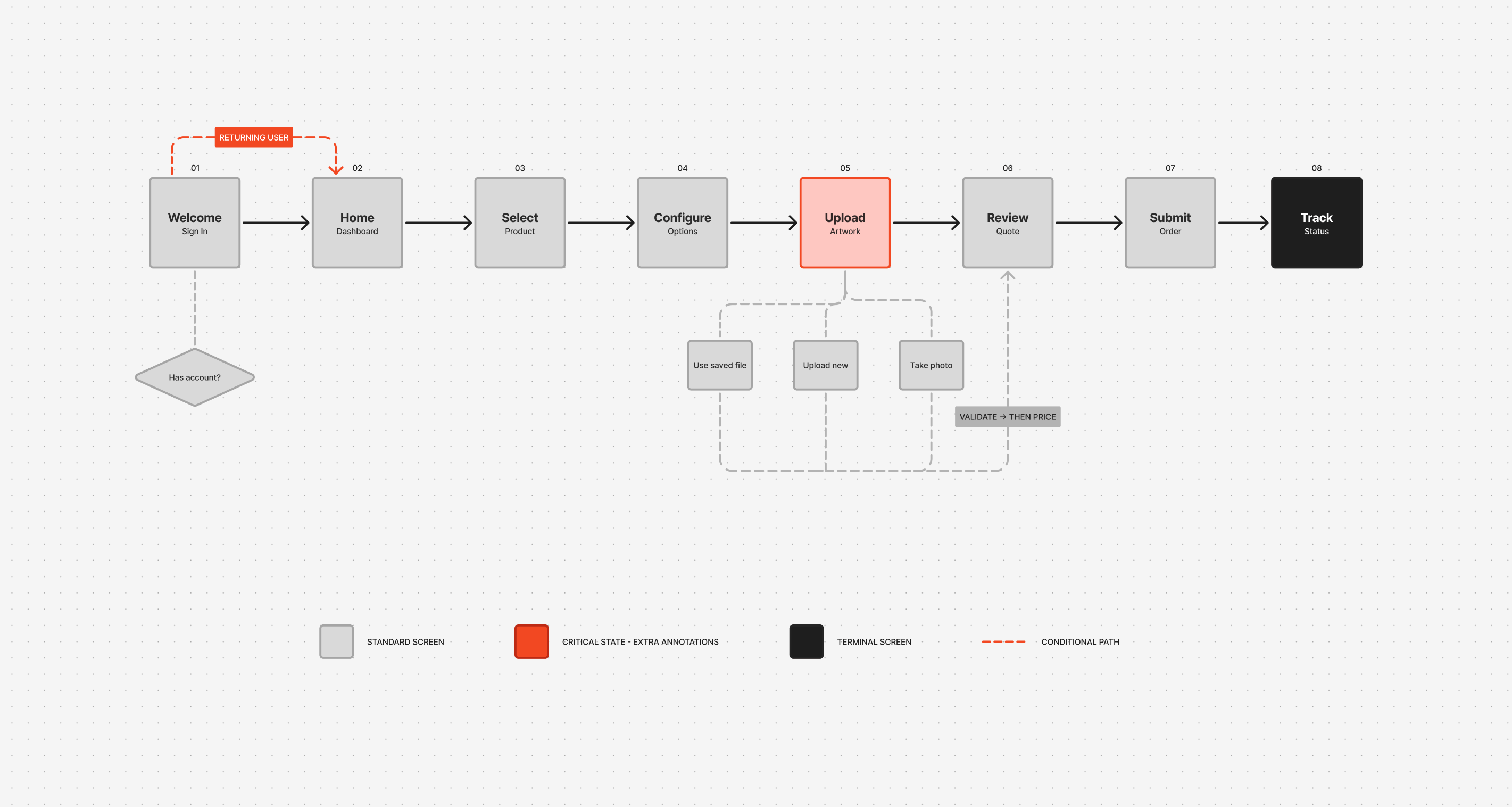
USER FLOW
The flow starts with sign-in, then moves through product selection, configuration, upload, review, payment, and tracking. Most of the experience is intentionally linear because the task has a clear sequence and users need confidence before submitting an order.
The main decision points are:
- Returning user versus new user.
- Saved artwork versus new upload.
- Valid file versus file issue.
- Successful payment versus failed payment.
- Order submitted versus order still in progress.
This structure keeps the experience easy to follow while still accounting for the cases that matter most in production.
DESIGN TOKENS
Every visible UI decision is controlled through a named token system: colour, typography, spacing, elevation, shape, and motion. The rule for the system is simple: if a value is not defined as a token, it should not be used in the interface. This keeps the design consistent in Figma and gives engineering a clear source of truth when translating the UI into Flutter.
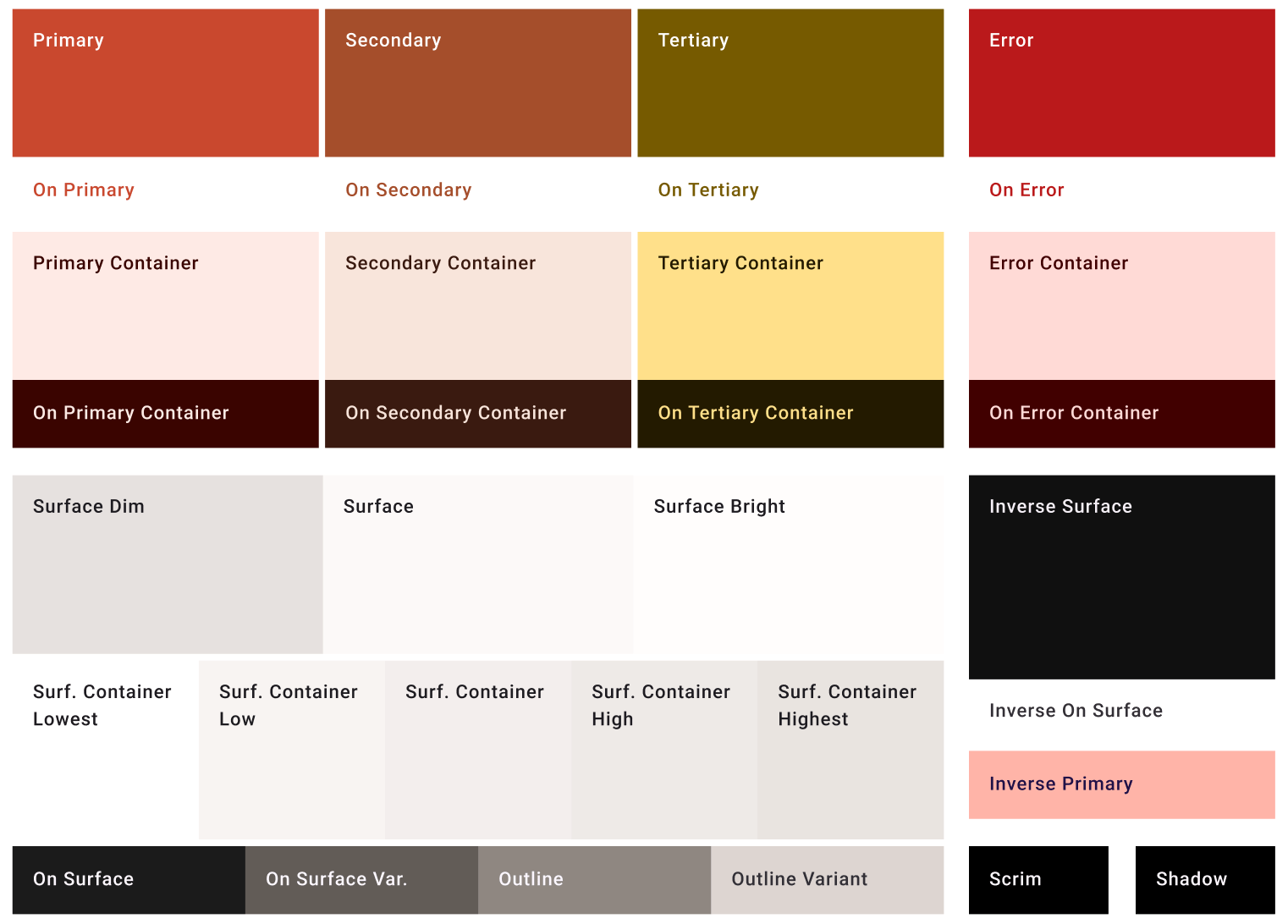
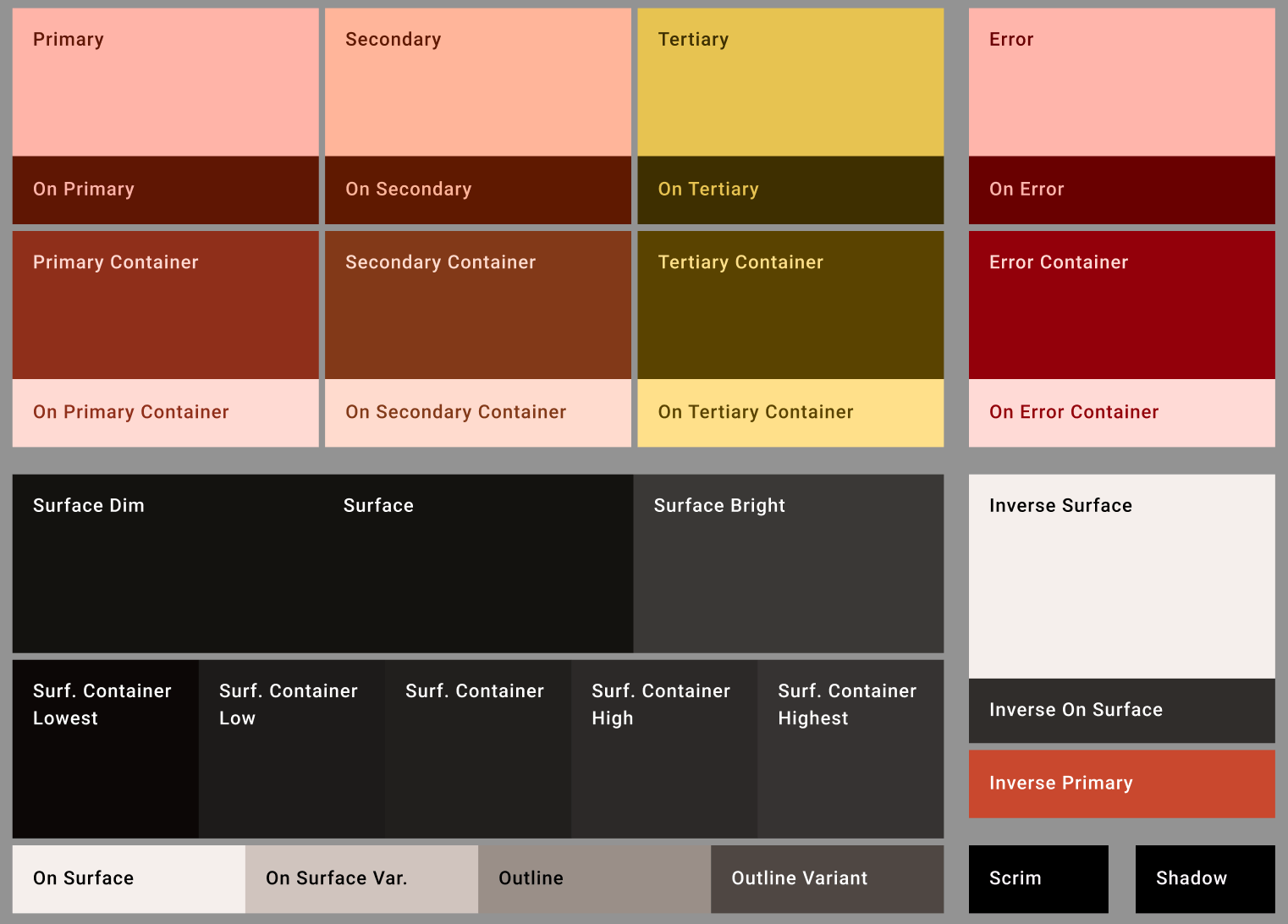
- Colour Roles
The colour system uses Material 3 roles generated from the PrintFlow brand seed colour. Both light and dark themes use the same role names so the design can switch themes without changing component logic.
The colour roles define:
- Primary actions and brand moments.
- Surface levels for cards, sheets, and app backgrounds.
- Error states for upload, validation, and payment issues.
- Outline and container colours for form fields, chips, and cards.
- Inverse colours for dark surfaces and high-emphasis UI.
LIGHT
DARK
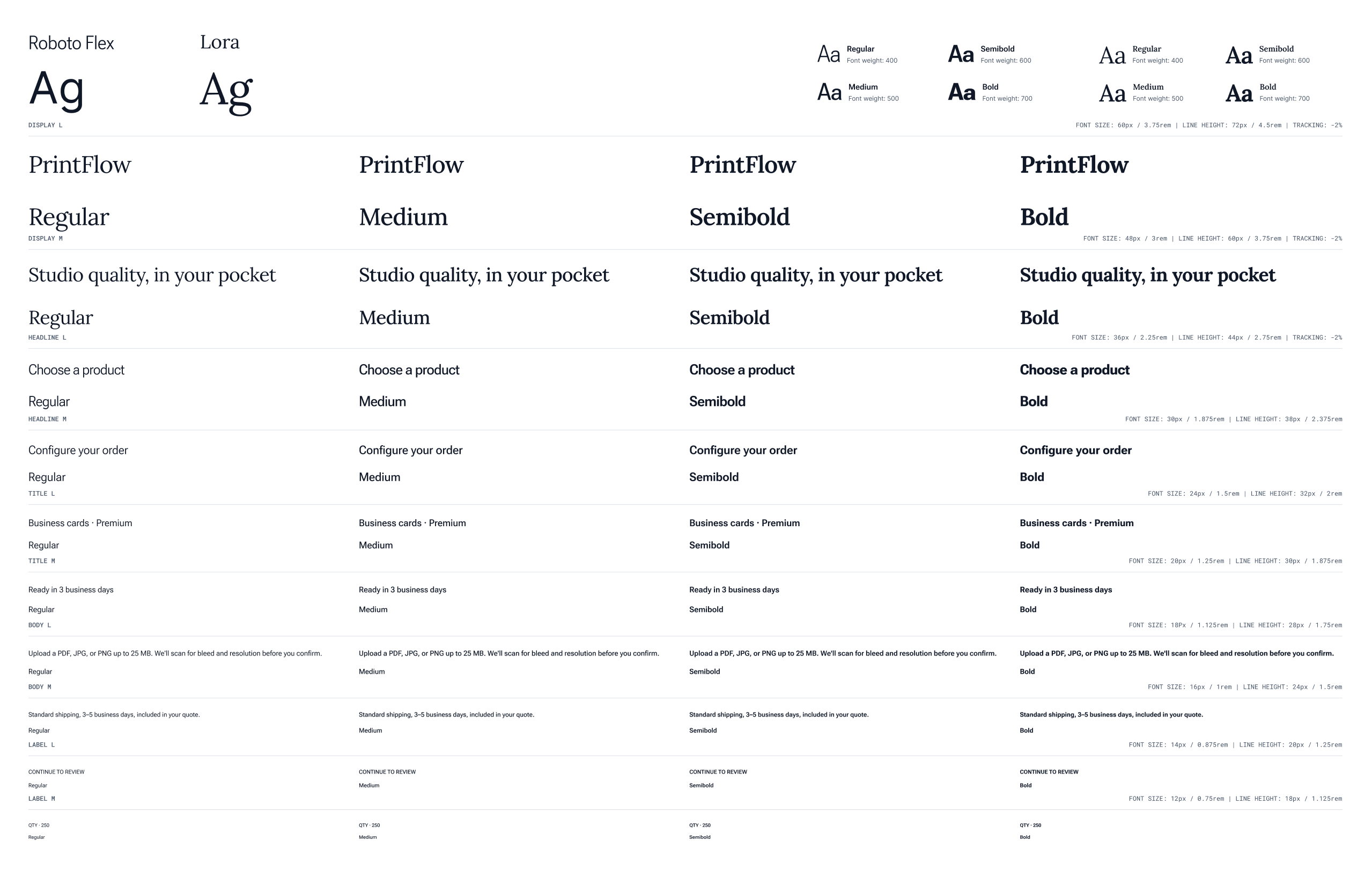
- Type Scale
The typography system uses a full Material 3 type scale mapped to product UI needs. Display and title styles are used sparingly for key moments, while body and label styles handle forms, product details, chips, helper text, and order information. The goal was not to create a decorative type system. The goal was to make hierarchy easy to scan on small screens.
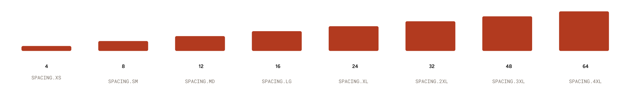
- Spacing Scale
Spacing follows a 4-point grid. Small values are used for chips, labels, and field relationships. Larger values are reserved for section separation, cards, bottom sheets, and screen-level padding. This helps the app feel consistent without creating one-off spacing decisions on every screen.
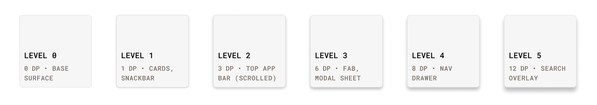
- Elevation
Elevation is used to communicate layering, not decoration. Cards, bottom sheets, navigation, floating actions, and overlays each have a defined elevation level. This gives Flutter implementation a clear structure and prevents inconsistent shadows across similar components.
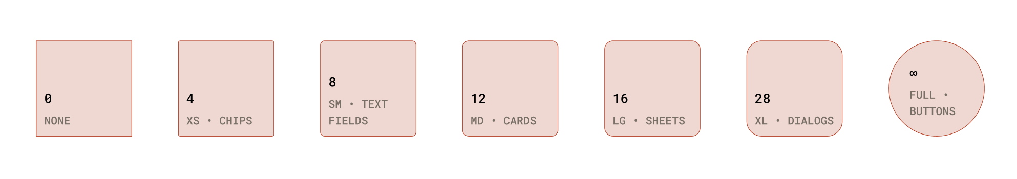
- Shape
Shape tokens are named by purpose instead of arbitrary values. Buttons use full pill shapes, fields and chips use smaller radii, cards use medium radii, and modal surfaces use larger radii. This creates a consistent visual language while still giving each component the right level of emphasis.
COMPONENT LIBRARY
The component library is structured from small reusable parts into larger product patterns. Buttons, fields, chips, list items, switches, cards, app bars, bottom sheets, progress indicators, and dialogs all include their expected states and Flutter equivalents.
The purpose of the library is to answer two questions before development starts:
- What is this component in Figma?
- What should it become in Flutter?
If a component cannot be named, reused, or mapped clearly, it should not ship as part of the system.
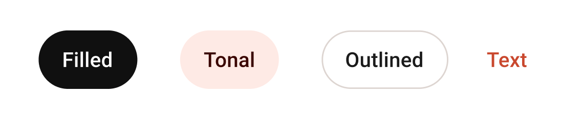
Buttons
Four variants. Filled is the high-emphasis primary action; tonal sits one step down; outlined and text handle secondary and tertiary actions respectively. Pill shape (radius: full) throughout.
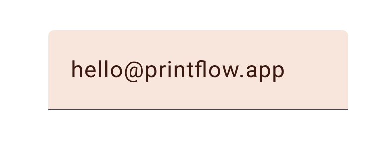
Text Field
Filled variant only — outlined is reserved for forms with three or more fields where rhythm matters. Floating label, supporting text, and error state all built in. Touch height 56dp.
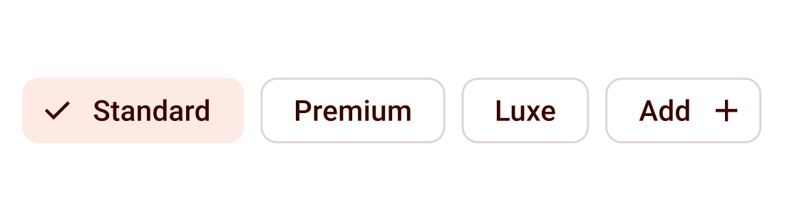
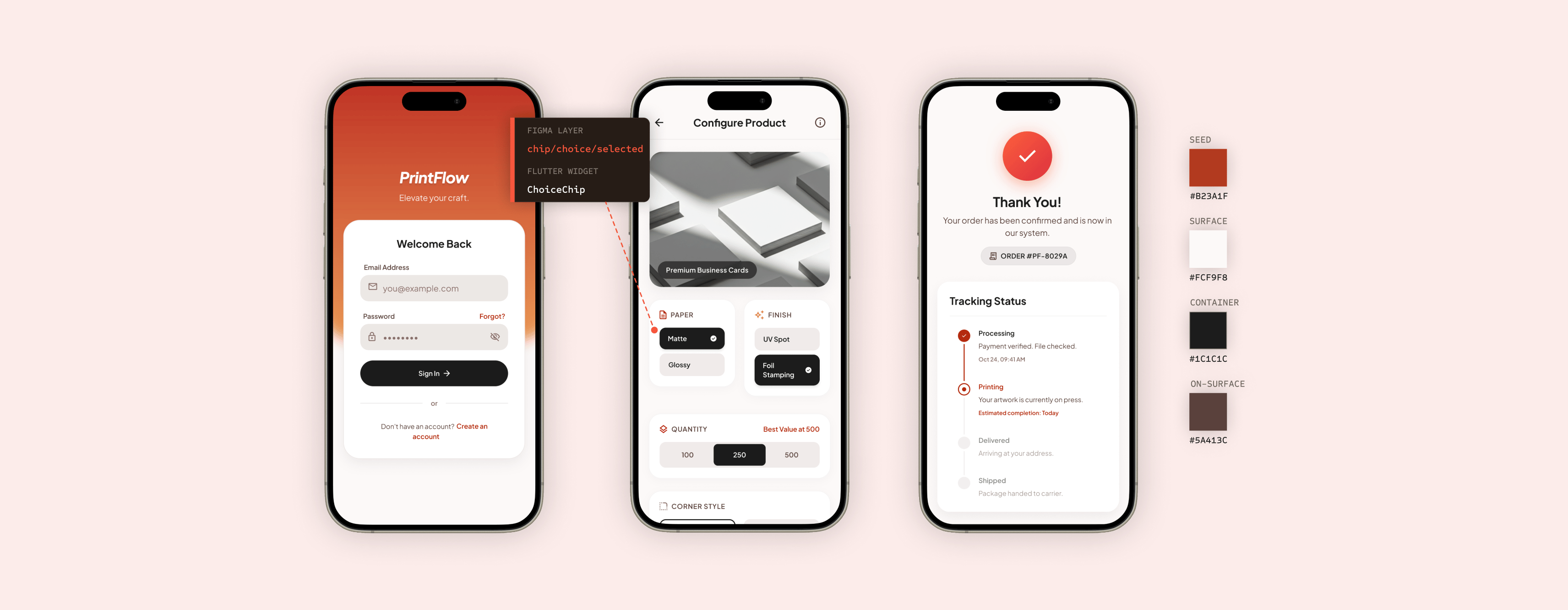
Chip · Filter / Choice
Used for paper stock, finish, and quantity ranges. Selected state uses secondary container background, no border. Chip width follows content.
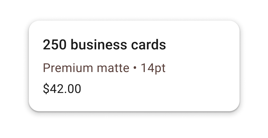
Card
Surface container background, 12dp radius, 1dp shadow. Used for product tiles, order summaries, and saved-payment selection. Tappable cards always have an InkWell.
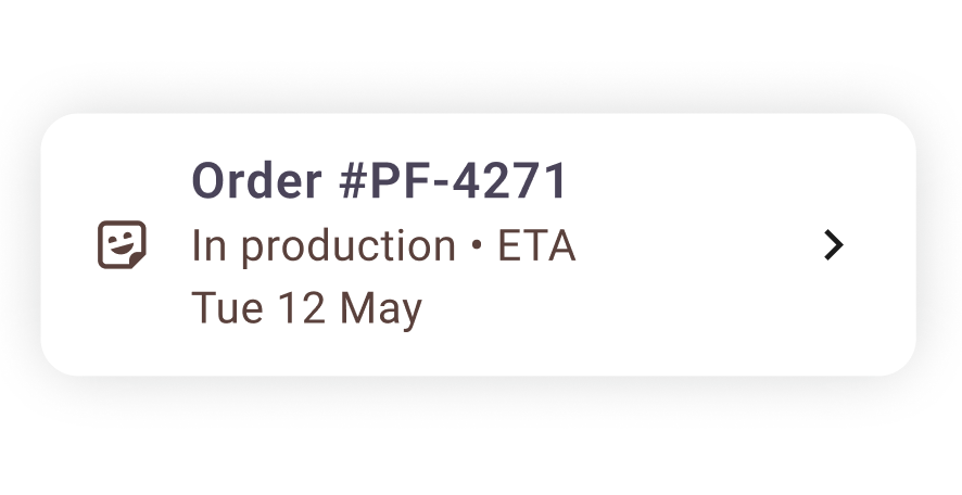
List Tile
Leading avatar / icon, two-line text, optional trailing chevron. Used for order history, saved files, address books. Min height 72dp; tap target spans full width.
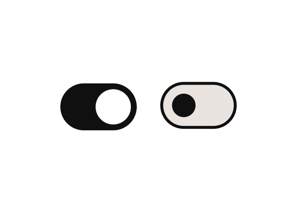
Switch
On state uses primary fill; off state shows outlined track with smaller thumb. Animated on change. Always paired with a label-left list tile, never floating.
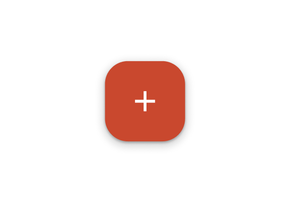
FAB · New order
Single FAB per screen, primary container colour, 16dp radius (M3 default), 6dp shadow. Anchored bottom-right with 16dp safe-area inset. Morphs to extended FAB on the home dashboard.

Linear Progress
4dp track, primary indicator on primary-container background. Determinate during file upload (shows %), indeterminate while quoting (shows shimmer).
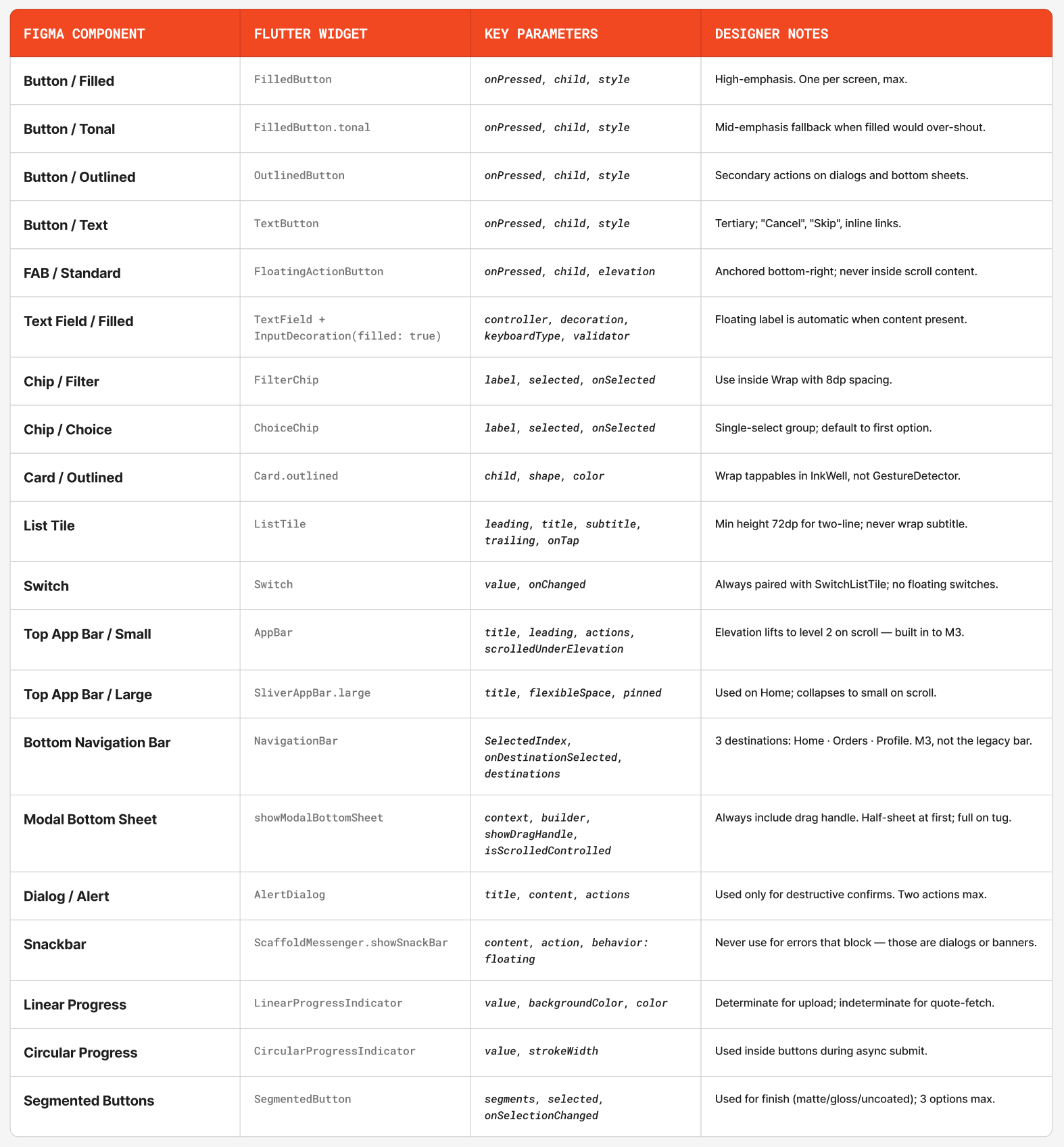
FIGMA TO FLUTTER
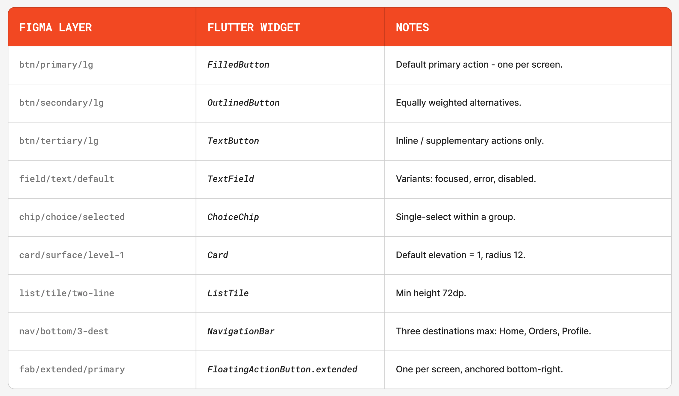
The handoff maps Figma components directly to Flutter widgets wherever possible. This reduces interpretation and helps developers understand which component properties need to be controlled.
Each mapping includes:
- Figma component name.
- Flutter widget equivalent.
- Required props or state values.
- Usage notes for where the component should appear.
This section is meant to function as a contract between design and engineering, not just a visual reference.
THE SCREENS
The final prototype includes eight screens that cover the core print-ordering journey from entry point to order tracking.
- Welcome & Sign in
This screen gives returning users a fast way into the app while keeping account creation available for new users.
- The primary sign-in action is the only high-emphasis button on the screen.
- Email and password fields use clear labels, helper states, and validation-ready structure.
- Password recovery stays close to the password field so users do not need to search for it.
- Account creation is secondary so it does not compete with the main sign-in task.
- Home Dashboard
The home screen helps users start a new order quickly while keeping recent activity and product discovery accessible.
- The top navigation keeps account access, brand recognition, and search close to the user.
- The hero card highlights the main task: starting a new print order.
- Featured products encourage browsing without blocking the primary flow.
- Bottom navigation separates Home, Products, Uploads, and Orders for repeat use.
- Select Product
This screen helps users choose the physical product they want to print through visual cards and clear product descriptions.
- Large product cards make each format easy to identify at a glance.
- Product descriptions explain the use case before the user commits.
- Badges highlight priority or popular options without adding extra steps.
- Arrow CTAs make each card feel actionable and easy to continue from.
- Configure Options
After choosing a product, users can customize the print specifications that affect price and production.
- The product image confirms what the user is configuring.
- Option cards group related choices such as paper, finish, quantity, and style.
- Selected states use strong contrast and checkmarks for clear feedback.
- Quantity options show value cues so users can understand the pricing tradeoff.
- Upload Artwork
This screen guides users through uploading print-ready artwork and explains what file types are supported.
- The upload area is the visual focus of the screen.
- Supported file chips communicate accepted formats before the user uploads.
- Upload progress is shown with a deterministic progress indicator.
- Users can choose a saved file, upload a new file, or take a photo when supported.
- Review & Confirm
The review screen gives users one final place to confirm their order details before payment.
- The order summary brings product, quantity, finish, file, and price into one view.
- Edit links allow users to correct details without restarting the flow.
- The price breakdown makes taxes, fees, and totals transparent.
- The submit action remains disabled until required confirmations are complete.
- Pay & Submit Order
This screen handles payment while making the submission step feel secure and final.
- Payment details are grouped separately from the order summary.
- Security and processing notes explain what happens when the user submits.
- The primary button changes to a loading state during submission.
- Duplicate submissions are prevented while payment is processing.
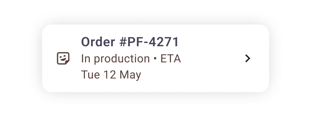
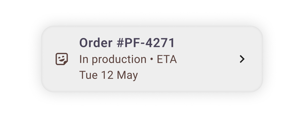
- Confirmation & Tracking
The final screen confirms the order and gives the user a clear next step.
- The confirmation message includes the order number for reference.
- The tracking timeline shows the current production stage and what comes next.
- Status labels use plain language instead of internal production terms.
- Reorder and support actions stay available without distracting from confirmation.
INTERACTION STATES
The component system includes the states most likely to affect implementation: enabled, hover, focused, pressed, disabled, empty, filled, error, loading, and selected. Documenting these states prevents engineers from having to invent behavior after the screen designs are approved.
Filled Button States

Enabled
Default state for the primary action on a screen.

Hover
Desktop and web preview state only. No behaviour change is required on mobile touch.

Focused
Keyboard and accessibility focus state. The focus ring must be visible without changing the button label.

Pressed
Touch feedback state used to confirm the interaction before navigation or submission.

Disabled
Used when required information is missing or an async action is in progress.
Text Field States

Empty
Label and placeholder guide the user before input.
Focused
Border and label treatment show the active field.
Filled
The label remains visible after the user enters content.

Error
Validation message appears after blur or submission, not on every keystroke.

Disabled
Used when the value is fixed, unavailable, or controlled by a previous selection.
Card
Resting
Default state for product, file, and order cards.
Pressed
Touch feedback confirms the card is interactive.
EDGE CASES
The prototype includes edge cases that would affect the build, not just the ideal flow.
First-time Dashboard
When the order history is empty, the dashboard collapses to a single empty-state card with one CTA, never a generic "nothing to see here." Action is the same as the FAB.
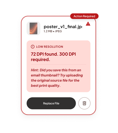
File-too-low-resolution
The most common upload failure. Message names the actual dpi found and the dpi required. "Source file" hint addresses the most common cause: users grabbing a thumbnail from email.
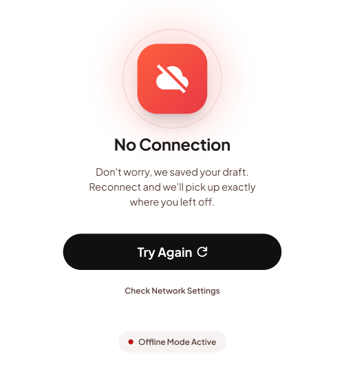
Offline or Network Failure
The app preserves the user’s form progress when the network drops. Once the connection returns, the user can continue from the same step instead of restarting the order.
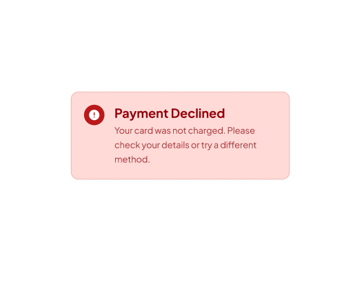
Payment Declined
Failed payment does not create an order or charge the user. The user is returned to the payment step with a clear error message and a direct path to try again.

Loading and Skeleton Screens
Product lists, dashboard content, and order details use skeleton screens during loading. This keeps the layout stable and avoids using spinners as the main waiting state.
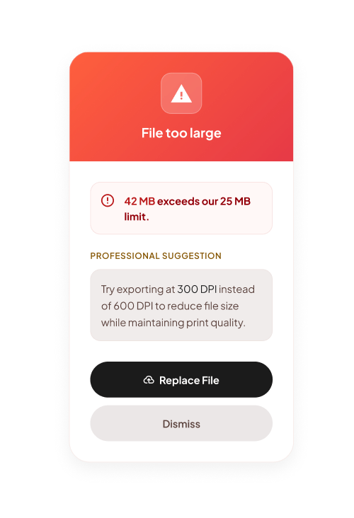
File Too Large
The upload is blocked before it starts if the file exceeds the size limit. The message explains the issue and gives the user a clear next step, such as replacing the file or reducing the file size.
HANDOFF SPEC
The handoff spec defines how the design should be named, exported, built, and checked before implementation. It gives developers the information that is usually missing from static screens.
- Naming Conventions
Figma layers and Flutter components use the same naming logic. A developer searching for a button, field, chip, card, or status component should be able to find the same concept in both the design file and the codebase.
Naming follows this structure:
- Component type.
- Variant.
- Size when needed.
- State when needed.
Example:
button/primary/large
maps to a primary filled button in Flutter.
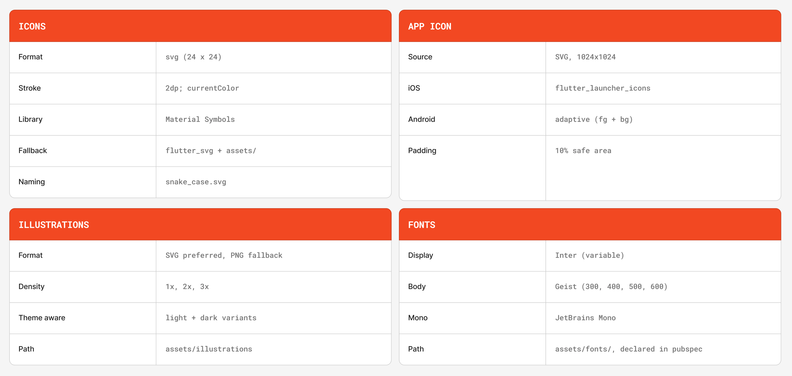
- Asset Exports
Illustrations, icons, and product imagery include export guidance so the developer knows which format, density, and theme version to use.
Export rules:
- Icons should use SVG whenever possible.
- Raster images should include 1x, 2x, and 3x assets.
- Theme-aware assets need light and dark variants.
- Assets should live in clearly named folders that match the app structure.
- Accessibility Targets
The design follows practical accessibility targets for mobile implementation.
48 dp
Minimum touch target
All interactive elements occupy at least 48 × 48 dp, even when the visual is smaller. Use InkWell or GestureDetector with explicit SizedBox.
4.5:1
Text contrast
Body text against background hits AA ratio in both themes. Verified per token pair in section 04.1.
3:1
Non-text contrast
Outline-only components (icons, dividers, focus rings) hit AA non-text against adjacent surface.
200%
Text scaling
Layouts reflow gracefully up to 200% system text size. No fixed-height containers around scalable text.
3x
Semantics labels
Every IconButton has a tooltip. Every image has alt-equivalent semanticLabel. Every form field has a paired label.
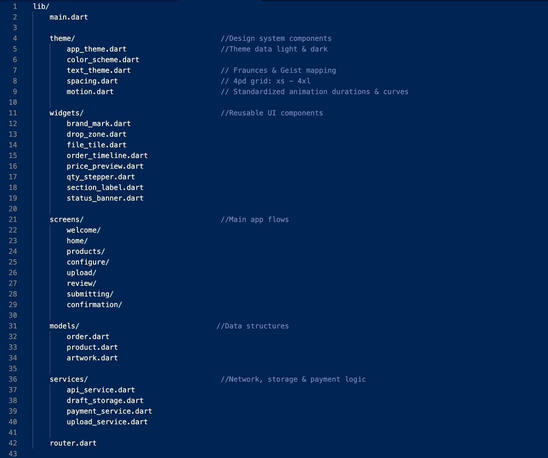
- Project Structure
The suggested Flutter structure separates theme, reusable widgets, and screens. This keeps the design system independent from individual flows and makes future updates easier. The theme files define colour, typography, spacing, and motion. Reusable widgets handle shared UI patterns. Screen folders contain the product flow, upload flow, review flow, payment flow, and tracking flow.
REFLECTION
The most useful decision in this project was writing the handoff spec before finishing the screens. It forced every component to answer three questions early: what is it called, what states does it support, and what does engineering need to know to build it correctly?
Building the state matrix early also made the screens stronger. Instead of only designing the happy path, the system accounted for disabled actions, upload failures, validation errors, payment issues, loading states, and network recovery. The area I would improve next is motion. The token system defines durations and easing, but the transitions between screens should be documented with the same level of detail as the components. In a future iteration, I would attach motion references to each transition so engineering can implement them without interpretation.
HANDOFF QUALITY INDICATORS
1:1
Figma components map directly to Flutter widget patterns.
8
Annotated screens covering the full order flow.
72
Documented states across reusable components.
2 themes
Light and dark mode supported through one token system.
0 guesswork
The handoff is structured to reduce implementation questions before development starts.
Wanna see more?
I know you wanna see more of the upload states, pricing logic, order flows, and tiny handoff decisions that make a build feel smoother. I’m happy to walk through how I designed PrintFlow from product selection to final order tracking. Reach out to me at bravomasnadia@gmail.com!
DESIGNED AND CODED BY
Nadia Bravo Mas
All rights reserved © 2026
PrintFlow Mobile App Development Handoff
A production-ready Figma-to-Flutter handoff for a custom print ordering app. I designed the end-to-end mobile flow, Material 3 token system, component states, screen annotations, and implementation notes needed to build the app with less ambiguity.
TIMELINE
1 week
ROLE
Senior Product Designer (Solo design, design
system, and handoff)
PROJECT TYPE
Concept case study
STACK
Figma
Material 3
Flutter
SUMMARY
PrintFlow is an eight-screen mobile experience for ordering custom print products from a phone. The project focuses on the part of product design that often gets overlooked in portfolios: translating polished screens into a system engineers can actually build. The final handoff includes a Material 3 token system, reusable components, named interaction states, edge-case handling, screen-level annotations, and Flutter widget mapping. The goal was to make the design clear enough that engineering would not need to guess how components behave, what states are required, or how the flow should respond when something goes wrong.
PROBLEM & GOAL
Custom print ordering can become complex quickly. Users need to choose a product, configure print options, upload artwork, confirm pricing, and submit payment before production can begin. Many print workflows are built for desktop or in-store support, which does not translate well to a customer ordering from a phone on a deadline.
The goal was to design a mobile flow that helps users submit a print-ready order quickly while giving developers a clear implementation path.
SUCCESS MEANT:
The user can move from product selection to order submission with minimal friction.
Pricing updates before payment so there are no surprises at checkout.
Uploads are validated before the user pays.
Every screen has one clear primary action.
Components, tokens, and states are documented using Flutter-ready language.
USER FLOW
The flow starts with sign-in, then moves through product selection, configuration, upload, review, payment, and tracking. Most of the experience is intentionally linear because the task has a clear sequence and users need confidence before submitting an order.
The main decision points are:
- Returning user versus new user.
- Saved artwork versus new upload.
- Valid file versus file issue.
- Successful payment versus failed payment.
- Order submitted versus order still in progress.
This structure keeps the experience easy to follow while still accounting for the cases that matter most in production.
DESIGN TOKENS
Every visible UI decision is controlled through a named token system: colour, typography, spacing, elevation, shape, and motion. The rule for the system is simple: if a value is not defined as a token, it should not be used in the interface. This keeps the design consistent in Figma and gives engineering a clear source of truth when translating the UI into Flutter.
- Colour Roles
The colour system uses Material 3 roles generated from the PrintFlow brand seed colour. Both light and dark themes use the same role names so the design can switch themes without changing component logic.
The colour roles define:
- Primary actions and brand moments.
- Surface levels for cards, sheets, and app backgrounds.
- Error states for upload, validation, and payment issues.
- Outline and container colours for form fields, chips, and cards.
- Inverse colours for dark surfaces and high-emphasis UI.
LIGHT
DARK
- Type Scale
The typography system uses a full Material 3 type scale mapped to product UI needs. Display and title styles are used sparingly for key moments, while body and label styles handle forms, product details, chips, helper text, and order information. The goal was not to create a decorative type system. The goal was to make hierarchy easy to scan on small screens.
- Spacing Scale
Spacing follows a 4-point grid. Small values are used for chips, labels, and field relationships. Larger values are reserved for section separation, cards, bottom sheets, and screen-level padding. This helps the app feel consistent without creating one-off spacing decisions on every screen.
- Elevation
Elevation is used to communicate layering, not decoration. Cards, bottom sheets, navigation, floating actions, and overlays each have a defined elevation level. This gives Flutter implementation a clear structure and prevents inconsistent shadows across similar components.
- Shape
Shape tokens are named by purpose instead of arbitrary values. Buttons use full pill shapes, fields and chips use smaller radii, cards use medium radii, and modal surfaces use larger radii. This creates a consistent visual language while still giving each component the right level of emphasis.
COMPONENT LIBRARY
The component library is structured from small reusable parts into larger product patterns. Buttons, fields, chips, list items, switches, cards, app bars, bottom sheets, progress indicators, and dialogs all include their expected states and Flutter equivalents.
The purpose of the library is to answer two questions before development starts:
- What is this component in Figma?
- What should it become in Flutter?
If a component cannot be named, reused, or mapped clearly, it should not ship as part of the system.
Buttons
Four variants. Filled is the high-emphasis primary action; tonal sits one step down; outlined and text handle secondary and tertiary actions respectively. Pill shape (radius: full) throughout.
Text Field
Filled variant only — outlined is reserved for forms with three or more fields where rhythm matters. Floating label, supporting text, and error state all built in. Touch height 56dp.
Chip · Filter / Choice
Used for paper stock, finish, and quantity ranges. Selected state uses secondary container background, no border. Chip width follows content.
Card
Surface container background, 12dp radius, 1dp shadow. Used for product tiles, order summaries, and saved-payment selection. Tappable cards always have an InkWell.
List Tile
Leading avatar / icon, two-line text, optional trailing chevron. Used for order history, saved files, address books. Min height 72dp; tap target spans full width.
Switch
On state uses primary fill; off state shows outlined track with smaller thumb. Animated on change. Always paired with a label-left list tile, never floating.
FAB · New order
Single FAB per screen, primary container colour, 16dp radius (M3 default), 6dp shadow. Anchored bottom-right with 16dp safe-area inset. Morphs to extended FAB on the home dashboard.
Linear Progress
4dp track, primary indicator on primary-container background. Determinate during file upload (shows %), indeterminate while quoting (shows shimmer).
FIGMA TO FLUTTER
The handoff maps Figma components directly to Flutter widgets wherever possible. This reduces interpretation and helps developers understand which component properties need to be controlled.
Each mapping includes:
- Figma component name.
- Flutter widget equivalent.
- Required props or state values.
- Usage notes for where the component should appear.
This section is meant to function as a contract between design and engineering, not just a visual reference.
THE SCREENS
The final prototype includes eight screens that cover the core print-ordering journey from entry point to order tracking.
- Welcome & Sign in
This screen gives returning users a fast way into the app while keeping account creation available for new users.
- The primary sign-in action is the only high-emphasis button on the screen.
- Email and password fields use clear labels, helper states, and validation-ready structure.
- Password recovery stays close to the password field so users do not need to search for it.
- Account creation is secondary so it does not compete with the main sign-in task.
- Home Dashboard
The home screen helps users start a new order quickly while keeping recent activity and product discovery accessible.
- The top navigation keeps account access, brand recognition, and search close to the user.
- The hero card highlights the main task: starting a new print order.
- Featured products encourage browsing without blocking the primary flow.
- Bottom navigation separates Home, Products, Uploads, and Orders for repeat use.
- Select Product
This screen helps users choose the physical product they want to print through visual cards and clear product descriptions.
- Large product cards make each format easy to identify at a glance.
- Product descriptions explain the use case before the user commits.
- Badges highlight priority or popular options without adding extra steps.
- Arrow CTAs make each card feel actionable and easy to continue from.
- Configure Options
After choosing a product, users can customize the print specifications that affect price and production.
- The product image confirms what the user is configuring.
- Option cards group related choices such as paper, finish, quantity, and style.
- Selected states use strong contrast and checkmarks for clear feedback.
- Quantity options show value cues so users can understand the pricing tradeoff.
- Upload Artwork
This screen guides users through uploading print-ready artwork and explains what file types are supported.
- The upload area is the visual focus of the screen.
- Supported file chips communicate accepted formats before the user uploads.
- Upload progress is shown with a deterministic progress indicator.
- Users can choose a saved file, upload a new file, or take a photo when supported.
- Review & Confirm
The review screen gives users one final place to confirm their order details before payment.
- The order summary brings product, quantity, finish, file, and price into one view.
- Edit links allow users to correct details without restarting the flow.
- The price breakdown makes taxes, fees, and totals transparent.
- The submit action remains disabled until required confirmations are complete.
- Pay & Submit Order
This screen handles payment while making the submission step feel secure and final.
- Payment details are grouped separately from the order summary.
- Security and processing notes explain what happens when the user submits.
- The primary button changes to a loading state during submission.
- Duplicate submissions are prevented while payment is processing.
- Confirmation & Tracking
The final screen confirms the order and gives the user a clear next step.
- The confirmation message includes the order number for reference.
- The tracking timeline shows the current production stage and what comes next.
- Status labels use plain language instead of internal production terms.
- Reorder and support actions stay available without distracting from confirmation.
INTERACTION STATES
The component system includes the states most likely to affect implementation: enabled, hover, focused, pressed, disabled, empty, filled, error, loading, and selected. Documenting these states prevents engineers from having to invent behavior after the screen designs are approved.
Filled Button States
Enabled
Default state for the primary action on a screen.
Hover
Desktop and web preview state only. No behaviour change is required on mobile touch.
Focused
Keyboard and accessibility focus state. The focus ring must be visible without changing the button label.
Pressed
Touch feedback state used to confirm the interaction before navigation or submission.
Disabled
Used when required information is missing or an async action is in progress.
Text Field States
Empty
Label and placeholder guide the user before input.
Focused
Border and label treatment show the active field.
Filled
The label remains visible after the user enters content.
Error
Validation message appears after blur or submission, not on every keystroke.
Disabled
Used when the value is fixed, unavailable, or controlled by a previous selection.
Card
Resting
Default state for product, file, and order cards.
Pressed
Touch feedback confirms the card is interactive.
EDGE CASES
The prototype includes edge cases that would affect the build, not just the ideal flow.
First-time Dashboard
When the order history is empty, the dashboard collapses to a single empty-state card with one CTA, never a generic "nothing to see here." Action is the same as the FAB.
File-too-low-resolution
The most common upload failure. Message names the actual dpi found and the dpi required. "Source file" hint addresses the most common cause: users grabbing a thumbnail from email.
Offline or Network Failure
The app preserves the user’s form progress when the network drops. Once the connection returns, the user can continue from the same step instead of restarting the order.
Payment Declined
Failed payment does not create an order or charge the user. The user is returned to the payment step with a clear error message and a direct path to try again.
Loading and Skeleton Screens
Product lists, dashboard content, and order details use skeleton screens during loading. This keeps the layout stable and avoids using spinners as the main waiting state.
File Too Large
The upload is blocked before it starts if the file exceeds the size limit. The message explains the issue and gives the user a clear next step, such as replacing the file or reducing the file size.
HANDOFF SPEC
The handoff spec defines how the design should be named, exported, built, and checked before implementation. It gives developers the information that is usually missing from static screens.
- Naming Conventions
Figma layers and Flutter components use the same naming logic. A developer searching for a button, field, chip, card, or status component should be able to find the same concept in both the design file and the codebase.
Naming follows this structure:
- Component type.
- Variant.
- Size when needed.
- State when needed.
Example:
button/primary/large
maps to a primary filled button in Flutter.
- Asset Exports
Illustrations, icons, and product imagery include export guidance so the developer knows which format, density, and theme version to use.
Export rules:
- Icons should use SVG whenever possible.
- Raster images should include 1x, 2x, and 3x assets.
- Theme-aware assets need light and dark variants.
- Assets should live in clearly named folders that match the app structure.
- Accessibility Targets
The design follows practical accessibility targets for mobile implementation.
48 dp
Minimum touch target
All interactive elements occupy at least 48 × 48 dp, even when the visual is smaller. Use InkWell or GestureDetector with explicit SizedBox.
4.5:1
Text contrast
Body text against background hits AA ratio in both themes. Verified per token pair in section 04.1.
3:1
Non-text contrast
Outline-only components (icons, dividers, focus rings) hit AA non-text against adjacent surface.
200%
Text scaling
Layouts reflow gracefully up to 200% system text size. No fixed-height containers around scalable text.
3x
Semantics labels
Every IconButton has a tooltip. Every image has alt-equivalent semanticLabel. Every form field has a paired label.
- Project Structure
The suggested Flutter structure separates theme, reusable widgets, and screens. This keeps the design system independent from individual flows and makes future updates easier. The theme files define colour, typography, spacing, and motion. Reusable widgets handle shared UI patterns. Screen folders contain the product flow, upload flow, review flow, payment flow, and tracking flow.
REFLECTION
The most useful decision in this project was writing the handoff spec before finishing the screens. It forced every component to answer three questions early: what is it called, what states does it support, and what does engineering need to know to build it correctly?
Building the state matrix early also made the screens stronger. Instead of only designing the happy path, the system accounted for disabled actions, upload failures, validation errors, payment issues, loading states, and network recovery. The area I would improve next is motion. The token system defines durations and easing, but the transitions between screens should be documented with the same level of detail as the components. In a future iteration, I would attach motion references to each transition so engineering can implement them without interpretation.
HANDOFF QUALITY INDICATORS
1:1
Figma components map directly to Flutter widget patterns.
8
Annotated screens covering the full order flow.
72
Documented states across reusable components.
2 themes
Light and dark mode supported through one token system.
0 guesswork
The handoff is structured to reduce implementation questions before development starts.
Wanna see more?
I know you wanna see more of the upload states, pricing logic, order flows, and tiny handoff decisions that make a build feel smoother. I’m happy to walk through how I designed PrintFlow from product selection to final order tracking. Reach out to me at bravomasnadia@gmail.com!
DESIGNED AND CODED BY
CONTACT
Nadia Bravo Mas
Let’s build something together!
All rights reserved © 2026
bravomasnadia@gmail.com
PrintFlow Mobile App Development Handoff
A production-ready Figma-to-Flutter handoff for a custom print ordering app. I designed the end-to-end mobile flow, Material 3 token system, component states, screen annotations, and implementation notes needed to build the app with less ambiguity.
TIMELINE
1 week
ROLE
Senior Product Designer(Solo design, design
system, and handoff)
PROJECT TYPE
Concept case study
STACK
Figma,
Material 3,
Flutter
SUMMARY
PrintFlow is an eight-screen mobile experience for ordering custom print products from a phone. The project focuses on the part of product design that often gets overlooked in portfolios: translating polished screens into a system engineers can actually build. The final handoff includes a Material 3 token system, reusable components, named interaction states, edge-case handling, screen-level annotations, and Flutter widget mapping. The goal was to make the design clear enough that engineering would not need to guess how components behave, what states are required, or how the flow should respond when something goes wrong.
PROBLEM & GOAL
Custom print ordering can become complex quickly. Users need to choose a product, configure print options, upload artwork, confirm pricing, and submit payment before production can begin. Many print workflows are built for desktop or in-store support, which does not translate well to a customer ordering from a phone on a deadline.
The goal was to design a mobile flow that helps users submit a print-ready order quickly while giving developers a clear implementation path.
SUCCESS MEANT:
The user can move from product selection to order submission with minimal friction.
Pricing updates before payment so there are no surprises at checkout.
Uploads are validated before the user pays.
Every screen has one clear primary action.
Components, tokens, and states are documented using Flutter-ready language.
USER FLOW
The flow starts with sign-in, then moves through product selection, configuration, upload, review, payment, and tracking. Most of the experience is intentionally linear because the task has a clear sequence and users need confidence before submitting an order.
The main decision points are:
- Returning user versus new user.
- Saved artwork versus new upload.
- Valid file versus file issue.
- Successful payment versus failed payment.
- Order submitted versus order still in progress.
This structure keeps the experience easy to follow while still accounting for the cases that matter most in production.
DESIGN TOKENS
Every visible UI decision is controlled through a named token system: colour, typography, spacing, elevation, shape, and motion. The rule for the system is simple: if a value is not defined as a token, it should not be used in the interface. This keeps the design consistent in Figma and gives engineering a clear source of truth when translating the UI into Flutter.
- Colour Roles
The colour system uses Material 3 roles generated from the PrintFlow brand seed colour. Both light and dark themes use the same role names so the design can switch themes without changing component logic.
The colour roles define:
- Primary actions and brand moments.
- Surface levels for cards, sheets, and app backgrounds.
- Error states for upload, validation, and payment issues.
- Outline and container colours for form fields, chips, and cards.
- Inverse colours for dark surfaces and high-emphasis UI.
LIGHT
DARK
- Type Scale
The typography system uses a full Material 3 type scale mapped to product UI needs. Display and title styles are used sparingly for key moments, while body and label styles handle forms, product details, chips, helper text, and order information. The goal was not to create a decorative type system. The goal was to make hierarchy easy to scan on small screens.
- Spacing Scale
Spacing follows a 4-point grid. Small values are used for chips, labels, and field relationships. Larger values are reserved for section separation, cards, bottom sheets, and screen-level padding. This helps the app feel consistent without creating one-off spacing decisions on every screen.
- Elevation
Elevation is used to communicate layering, not decoration. Cards, bottom sheets, navigation, floating actions, and overlays each have a defined elevation level. This gives Flutter implementation a clear structure and prevents inconsistent shadows across similar components.
- Shape
Shape tokens are named by purpose instead of arbitrary values. Buttons use full pill shapes, fields and chips use smaller radii, cards use medium radii, and modal surfaces use larger radii. This creates a consistent visual language while still giving each component the right level of emphasis.
COMPONENT LIBRARY
The component library is structured from small reusable parts into larger product patterns. Buttons, fields, chips, list items, switches, cards, app bars, bottom sheets, progress indicators, and dialogs all include their expected states and Flutter equivalents.
The purpose of the library is to answer two questions before development starts:
- What is this component in Figma?
- What should it become in Flutter?
If a component cannot be named, reused, or mapped clearly, it should not ship as part of the system.
Buttons
Four variants. Filled is the high-emphasis primary action; tonal sits one step down; outlined and text handle secondary and tertiary actions respectively. Pill shape (radius: full) throughout.
Text Field
Filled variant only — outlined is reserved for forms with three or more fields where rhythm matters. Floating label, supporting text, and error state all built in. Touch height 56dp.
Chip · Filter / Choice
Used for paper stock, finish, and quantity ranges. Selected state uses secondary container background, no border. Chip width follows content.
Card
Surface container background, 12dp radius, 1dp shadow. Used for product tiles, order summaries, and saved-payment selection. Tappable cards always have an InkWell.
List Tile
Leading avatar / icon, two-line text, optional trailing chevron. Used for order history, saved files, address books. Min height 72dp; tap target spans full width.
Switch
On state uses primary fill; off state shows outlined track with smaller thumb. Animated on change. Always paired with a label-left list tile, never floating.
FAB · New order
Single FAB per screen, primary container colour, 16dp radius (M3 default), 6dp shadow. Anchored bottom-right with 16dp safe-area inset. Morphs to extended FAB on the home dashboard.
Linear Progress
4dp track, primary indicator on primary-container background. Determinate during file upload (shows %), indeterminate while quoting (shows shimmer).
FIGMA TO FLUTTER
The handoff maps Figma components directly to Flutter widgets wherever possible. This reduces interpretation and helps developers understand which component properties need to be controlled.
Each mapping includes:
- Figma component name.
- Flutter widget equivalent.
- Required props or state values.
- Usage notes for where the component should appear.
This section is meant to function as a contract between design and engineering, not just a visual reference.
THE SCREENS
The final prototype includes eight screens that cover the core print-ordering journey from entry point to order tracking.
- Welcome & Sign in
This screen gives returning users a fast way into the app while keeping account creation available for new users.
- The primary sign-in action is the only high-emphasis button on the screen.
- Email and password fields use clear labels, helper states, and validation-ready structure.
- Password recovery stays close to the password field so users do not need to search for it.
- Account creation is secondary so it does not compete with the main sign-in task.
- Home Dashboard
The home screen helps users start a new order quickly while keeping recent activity and product discovery accessible.
- The top navigation keeps account access, brand recognition, and search close to the user.
- The hero card highlights the main task: starting a new print order.
- Featured products encourage browsing without blocking the primary flow.
- Bottom navigation separates Home, Products, Uploads, and Orders for repeat use.
- Select Product
This screen helps users choose the physical product they want to print through visual cards and clear product descriptions.
- Large product cards make each format easy to identify at a glance.
- Product descriptions explain the use case before the user commits.
- Badges highlight priority or popular options without adding extra steps.
- Arrow CTAs make each card feel actionable and easy to continue from.
- Configure Options
After choosing a product, users can customize the print specifications that affect price and production.
- The product image confirms what the user is configuring.
- Option cards group related choices such as paper, finish, quantity, and style.
- Selected states use strong contrast and checkmarks for clear feedback.
- Quantity options show value cues so users can understand the pricing tradeoff.
- Upload Artwork
This screen guides users through uploading print-ready artwork and explains what file types are supported.
- The upload area is the visual focus of the screen.
- Supported file chips communicate accepted formats before the user uploads.
- Upload progress is shown with a deterministic progress indicator.
- Users can choose a saved file, upload a new file, or take a photo when supported.
- Review & Confirm
The review screen gives users one final place to confirm their order details before payment.
- The order summary brings product, quantity, finish, file, and price into one view.
- Edit links allow users to correct details without restarting the flow.
- The price breakdown makes taxes, fees, and totals transparent.
- The submit action remains disabled until required confirmations are complete.
- Pay & Submit Order
This screen handles payment while making the submission step feel secure and final.
- Payment details are grouped separately from the order summary.
- Security and processing notes explain what happens when the user submits.
- The primary button changes to a loading state during submission.
- Duplicate submissions are prevented while payment is processing.
- Confirmation & Tracking
The final screen confirms the order and gives the user a clear next step.
- The confirmation message includes the order number for reference.
- The tracking timeline shows the current production stage and what comes next.
- Status labels use plain language instead of internal production terms.
- Reorder and support actions stay available without distracting from confirmation.
INTERACTION STATES
The component system includes the states most likely to affect implementation: enabled, hover, focused, pressed, disabled, empty, filled, error, loading, and selected. Documenting these states prevents engineers from having to invent behavior after the screen designs are approved.
Filled Button States
Enabled
Default state for the primary action on a screen.
Hover
Desktop and web preview state only. No behaviour change is required on mobile touch.
Focused
Keyboard and accessibility focus state. The focus ring must be visible without changing the button label.
Pressed
Touch feedback state used to confirm the interaction before navigation or submission.
Disabled
Used when required information is missing or an async action is in progress.
Text Field States
Empty
Label and placeholder guide the user before input.
Focused
Border and label treatment show the active field.
Filled
The label remains visible after the user enters content.
Error
Validation message appears after blur or submission, not on every keystroke.
Disabled
Used when the value is fixed, unavailable, or controlled by a previous selection.
Card
Resting
Default state for product, file, and order cards.
Pressed
Touch feedback confirms the card is interactive.
EDGE CASES
The prototype includes edge cases that would affect the build, not just the ideal flow.
First-time Dashboard
When the order history is empty, the dashboard collapses to a single empty-state card with one CTA, never a generic "nothing to see here." Action is the same as the FAB.
File-too-low-resolution
The most common upload failure. Message names the actual dpi found and the dpi required. "Source file" hint addresses the most common cause: users grabbing a thumbnail from email.
Offline or Network Failure
The app preserves the user’s form progress when the network drops. Once the connection returns, the user can continue from the same step instead of restarting the order.
Payment Declined
Failed payment does not create an order or charge the user. The user is returned to the payment step with a clear error message and a direct path to try again.
Loading and Skeleton Screens
Product lists, dashboard content, and order details use skeleton screens during loading. This keeps the layout stable and avoids using spinners as the main waiting state.
File Too Large
The upload is blocked before it starts if the file exceeds the size limit. The message explains the issue and gives the user a clear next step, such as replacing the file or reducing the file size.
HANDOFF SPEC
The handoff spec defines how the design should be named, exported, built, and checked before implementation. It gives developers the information that is usually missing from static screens.
- Naming Conventions
Figma layers and Flutter components use the same naming logic. A developer searching for a button, field, chip, card, or status component should be able to find the same concept in both the design file and the codebase.
Naming follows this structure:
- Component type.
- Variant.
- Size when needed.
- State when needed.
Example:
button/primary/large
maps to a primary filled button in Flutter.
- Asset Exports
Illustrations, icons, and product imagery include export guidance so the developer knows which format, density, and theme version to use.
Export rules:
- Icons should use SVG whenever possible.
- Raster images should include 1x, 2x, and 3x assets.
- Theme-aware assets need light and dark variants.
- Assets should live in clearly named folders that match the app structure.
- Accessibility Targets
The design follows practical accessibility targets for mobile implementation.
48 dp
Minimum touch target
All interactive elements occupy at least 48 × 48 dp, even when the visual is smaller. Use InkWell or GestureDetector with explicit SizedBox.
4.5:1
Text contrast
Body text against background hits AA ratio in both themes. Verified per token pair in section 04.1.
3:1
Non-text contrast
Outline-only components (icons, dividers, focus rings) hit AA non-text against adjacent surface.
200%
Text scaling
Layouts reflow gracefully up to 200% system text size. No fixed-height containers around scalable text.
3x
Semantics labels
Every IconButton has a tooltip. Every image has alt-equivalent semanticLabel. Every form field has a paired label.
- Project Structure
The suggested Flutter structure separates theme, reusable widgets, and screens. This keeps the design system independent from individual flows and makes future updates easier. The theme files define colour, typography, spacing, and motion. Reusable widgets handle shared UI patterns. Screen folders contain the product flow, upload flow, review flow, payment flow, and tracking flow.
REFLECTION
The most useful decision in this project was writing the handoff spec before finishing the screens. It forced every component to answer three questions early: what is it called, what states does it support, and what does engineering need to know to build it correctly?
Building the state matrix early also made the screens stronger. Instead of only designing the happy path, the system accounted for disabled actions, upload failures, validation errors, payment issues, loading states, and network recovery. The area I would improve next is motion. The token system defines durations and easing, but the transitions between screens should be documented with the same level of detail as the components. In a future iteration, I would attach motion references to each transition so engineering can implement them without interpretation.
HANDOFF QUALITY INDICATORS
1:1
Figma components map directly to Flutter widget patterns.
8
Annotated screens covering the full order flow.
72
Documented states across reusable components.
2 themes
Light and dark mode supported through one token system.
0 guesswork
The handoff is structured to reduce implementation questions before development starts.
Wanna see more?
I know you wanna see more of the upload states, pricing logic, order flows, and tiny handoff decisions that make a build feel smoother. I’m happy to walk through how I designed PrintFlow from product selection to final order tracking. Reach out to me at bravomasnadia@gmail.com!
DESIGNED AND CODED BY
CONTACT
Nadia Bravo Mas
Let’s build something together!
All rights reserved © 2026
bravomasnadia@gmail.com